Universe — Website Builder
Universe Review
Official website: onuniverse.com
Category: Productivity
Version we tested: 1.22.1 (free)
Compatibility: iOS 10.0+ iPhone, iPad, iPod touch
Registration
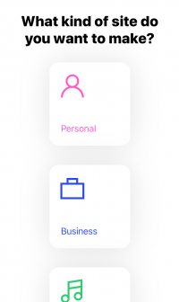
On first launch, the Universe app asks you what kind of website you want to make: Personal, Business, Creator, Event or other.
This simple question helps you make clear what is the purpose of your website, and your answer will customize the subsequent forms: title, description, social networks...).
At the end of the wizard, you select a xxx.onuniverse.com name, pick up a "filter" (graphical theme) and your site gets published right away.
Exploration
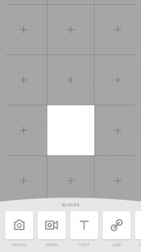
On the Universe app, you website appears on a 3-column table (expandable up to a 5-column table), and you place blocks of contents on 1 or more cells on this grid.
To resize a block, perform the 2-finger pinch/zoom gesture (placing 2 fingers in the same cell may be tricky if you have big fingers... but, yes, you can definitely do it!).
To move a block, perform the tap and drag gesture. As you go, you build your home page as a vertical roll, like a Japanese kakemono.
Here are the kinds of contents you can add (swipe from right to left to horizontally scroll the kinds of block):
• Photo from your iPhone (with image filters) or Giphy.com (animated pics).
• Video from your iPhone (2s duration limit), YouTube or Vimeo.
• Text: text properties (font, shadow, size, color, alignment) and background (colors and shapes) can be adjusted.
• Social media icons, linked to your own social media pages.
• SMS, phone or email icons, to get in touch with you directly (there is no contact form).
• Map from Google, with nice color filters.
• Music from SoundCloud
• Colored dot with various shapes, colors and color gradients.
• Code, including HTML, CSS and JavaScript.
Text, picture, video and colored dot blocks can be linked to another page of your website or to any other website.
If you have a good sense of visual design, you will appreciate the fact that you can layout your content freely either on the left-hand side, in the middle or in the right-hand side. It's really fun!
Then, you can build other pages of your website. Each page is also organized as a table, just like the home page. And you can even add simple blog posts (picture+text).
Building a complete website with the Universe app
You will soon discover that Universe app is quite disruptive.
For example:
1. It assumes that horizontal swiping gesture is commonly used.
In the Universe app, when you feel you are in a blind dead-end or that a feature is missing, there are good chances that you are just a horizontal stripe away from the solution of the issue. With some effort, you will learn this by try and error. But can you reasonably expect that the mobile users visiting your website will swipe horizontally the main top menu bar of your website and discover that it contains more than 3 pages? Maybe not. You would be wiser to limit your website to 3 pages.
2. Its "grid approach" is unique among website builder apps. If you have worked on desktop publishing applications, you will probably like Universe app. Graphical design is very appealing and Universe is the only app with which you can make a poster-like website. But don't forget that, if you want your web page to be properly ranked by search engines, you have to write at least a few hundred words on it.
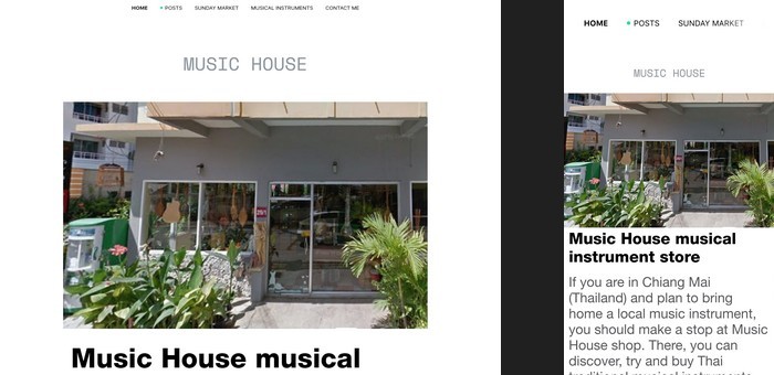
3. The published version of the website is not responsive. It looks good on a mobile phone, but not on a computer: font size is too big and a scroll bar appears to the right of each block! As of today, mobile now accounts for the biggest share of website traffic, but traffic from computer is still quite significant for most websites.
The above disruptive approach may be the right one in the future, when right-to-left horizontally gesture are commonly used on mobile phones and when computers become a very marginal source of web traffic. We think that today, we are not there yet.
On the other hand, a few common features for website builders are missing:
• Contact form: While Universe app focusses on social media sharing, it does not feature any basic contact form on the website. In some cases, the social networks used by the author of the website are not the same as the social networks used by the visitors of the websites. And many people do not have access to their email box from their mobiles phones.
Evaluation
Ease of use
★★★☆☆
Universe app has a nice design and works smoothly. It requires some finger gestures that are not commonly used though: horizontal swiping, and pinching out items that are not pictures. As finger gestures have low discovarability, it's quite hard to learn how to use this app.
Features
★★★☆☆
Page layout is very flexible with Universe app. Each block can have its own background, and this is great for visual design. Google Map themes and image filters are other visual features that are quite unique among website builders for iPhone. On the other hand, it lacks e-commerce and contact form capapilities, as well as text underscoring (a common visual marker for hypertext links). Note that the Pro package provide a few more features, like traffic analytics.
Clarity
★★☆☆☆
If you can imagine each page of your website like a poster, then Universe app will definitely help you make it real. On the other hand, if you primarily think about main ideas and sub-topics that each page should develop, you will face these kinds of dilemmas : Should I create a block for the main topic and another block for each sub-topic? Where are bullet and numbered lists? How to make this word bold? Why can't the blocks adjust their size automatically when I add some text in them? How to indent this paragraph slightly compared to the previous one?
Frankly speaking, Universe app focusses so much on visual design that, if you need a blank page to explore and draft your ideas to organize them, then you'd better use a note-taking application first, and only then copy-paste your text into Universe app when it's all set.
Universe app does not seem to provide any guidance for creating a website (or just, how to use their app).
Design
★☆☆☆☆
If your website contains only a couple of pages, it should look nice on a mobile phone, and the in-app editor is a faithful preview of what you will get. But, you should not expect your website to look good also on computers.
Lightness
★☆☆☆☆
Universe website load fast, but the text on the page cannot be properly analyzed by search engines, and it's not possible to customize the "Description" metadata on each page. You should not expect that Google Search or Bing will help getting more visits of your Universe website.
Chance to complete
★☆☆☆☆
If you plan to make a simple website for an art exhibition or an artist profile (or your own instagram profile), then you can confidently use Universe app. For any other purpose, you'd better look for another app.


